
Mobile Menu Bar
von PlumSpace · Design & Widgets

von PlumSpace · Design & Widgets
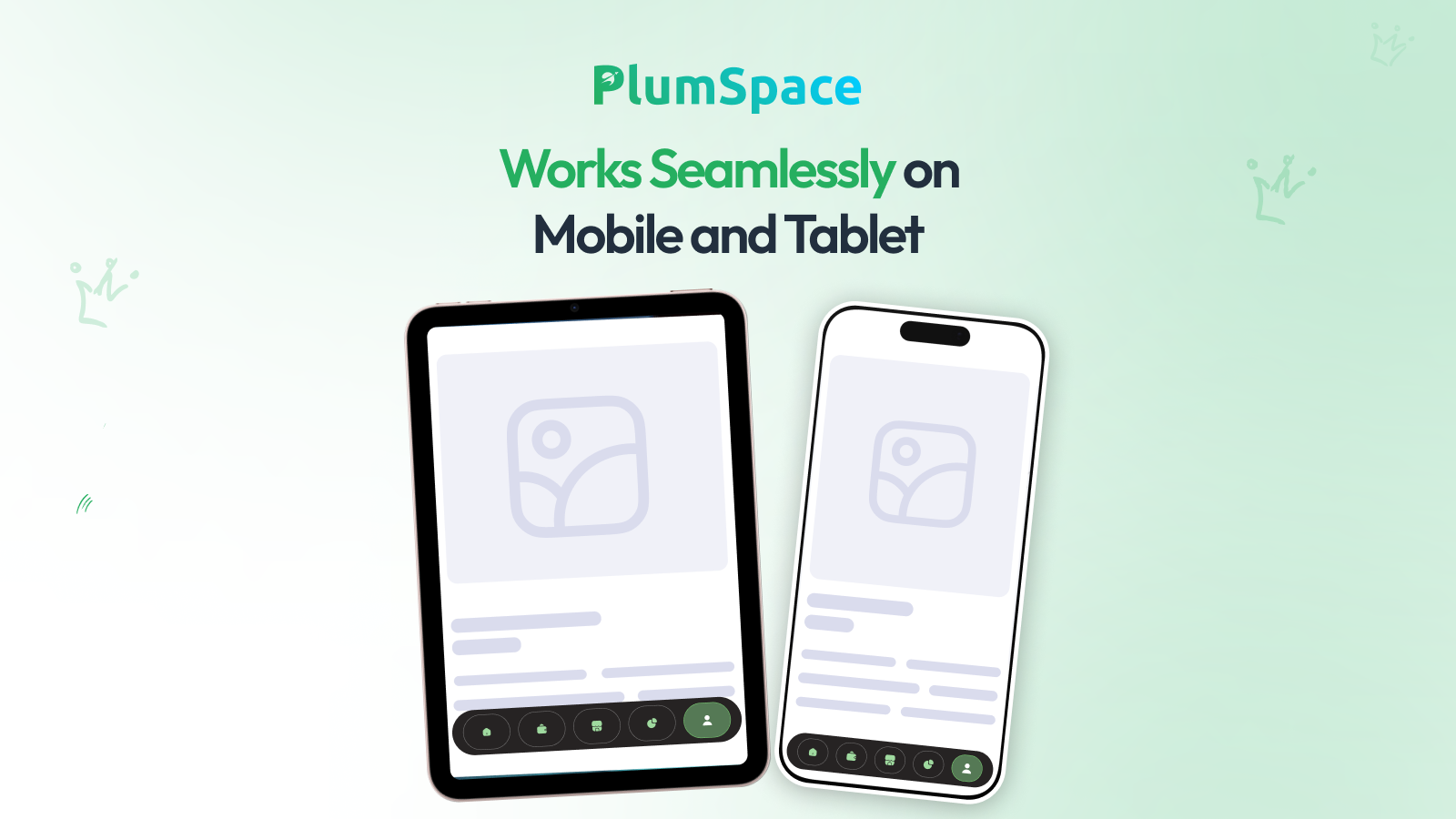
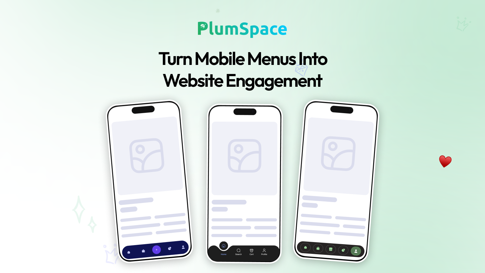
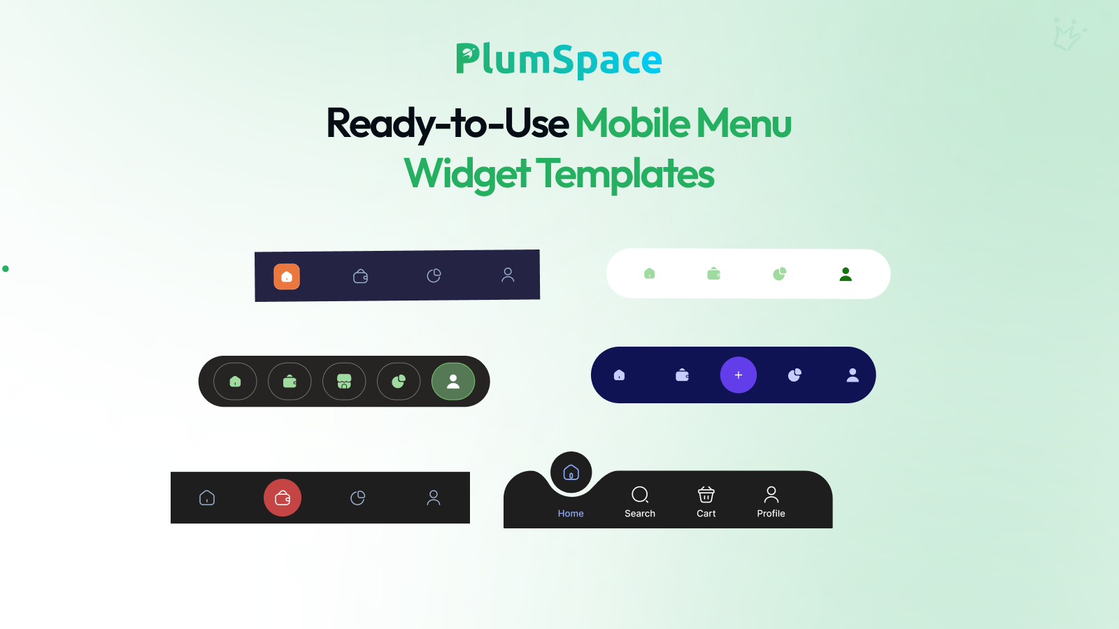
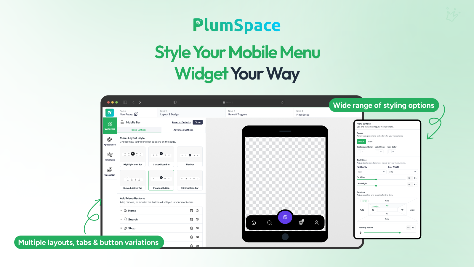
Designed specifically for smartphones and tablets, it transforms your mobile site into a fast, intuitive experience that mimics a native mobile app. Customers can access high-priority pages like Home, Search, Shop, and Cart with a single tap, removing the friction of hunting through traditional hamburger menus. With multiple layout styles—including Floating Buttons, Curved Tabs, and Flat Bars—you can fully customize icons, colors, and spacing to match your brand identity perfectly.
Noch keine Funktionsliste verfügbar.
Noch keine Bewertungen
Händlerbewertungen erscheinen hier, sobald sie ihre Erfahrungen teilen mit Mobile Menu Bar.